
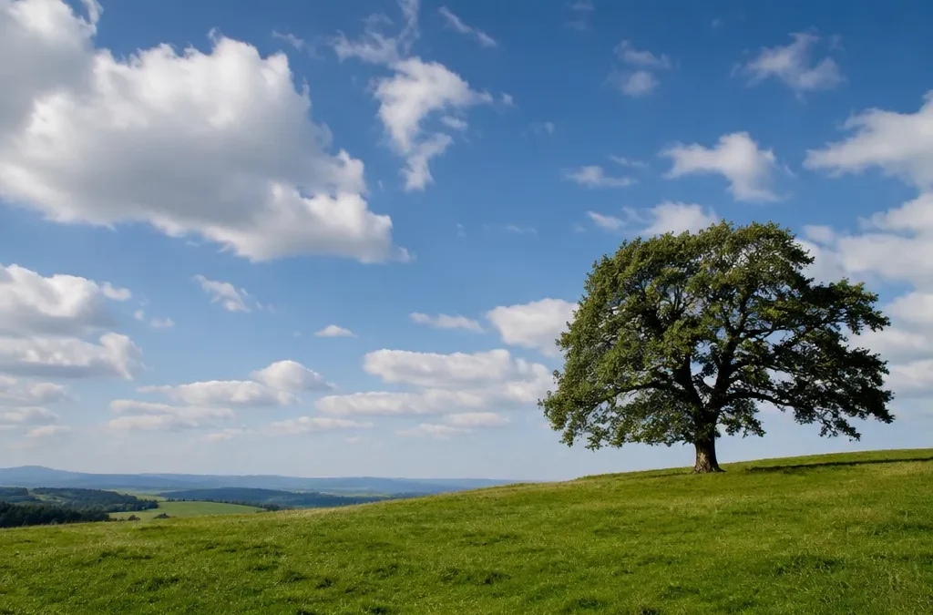
The rule of thirds is a composition guideline that splits your frame into nine equal parts with two horizontal and two vertical lines. Instead of putting your subject dead center, you place it on one of those lines or near one of the four points where they cross. The result usually feels more balanced and more alive, because the eye has space to move through the picture.
It is the first composition rule most photographers learn, and for good reason: it is simple, it works in almost every genre, and you can turn on a grid in your phone or camera to use it right away. Below you will find what the rule of thirds is, how to switch on the grid, examples from landscape, portrait and street photography, and when you should break it on purpose.
What is the rule of thirds?
Picture a tic-tac-toe board laid over your viewfinder. The two horizontal lines divide the image into thirds from top to bottom. The two vertical lines divide it into thirds from left to right. The four points where the lines meet are often called power points or intersections.
The rule of thirds says you get a stronger composition when you:
- place the main subject on or near one of the four intersections,
- line up strong horizontal elements, like a horizon or a shoreline, with the upper or lower line,
- line up strong vertical elements, like a tree, a building or a standing person, with the left or right line.
The idea is older than photography. The term was first written down by the English painter and engraver John Thomas Smith in his 1797 book Remarks on Rural Scenery, where he described a pleasing balance of light and dark in a landscape painting. Photographers picked it up later because it translates so well to a rectangular frame.
Why the rule of thirds works
A subject placed in the exact center tends to look static. The eye lands on it and stops. When you move the subject off center, you create a relationship between the subject and the empty space around it. That space, sometimes called negative space, gives the picture direction and tension.
Off-center placement also helps you tell a story. A person looking into the open two-thirds of the frame suggests where they are going or what they are thinking about. A horizon on the lower third says the sky is the star of the photo. A horizon on the upper third says the foreground matters more.
How to turn on the rule of thirds grid
A grid overlay is the easiest way to practice. It shows the thirds lines on your screen but never appears in the saved photo. Menu names change between software versions, so if you do not see the exact wording below, look for “grid” or “composition” in your camera settings.
iPhone
- Open the Settings app.
- Tap Camera.
- Turn on Grid.
The next time you open the Camera app, you will see a 3 x 3 grid on the screen.
Android phones
Most Android camera apps put the grid inside the camera app itself:
- Samsung Galaxy: open the Camera app, tap the settings gear, and turn on Grid lines. On newer One UI versions the option is called Composition guide.
- Google Pixel: open the Pixel Camera app, open the settings, and look for Grid type in the composition section. You can choose 3 x 3, 4 x 4 or golden ratio. Pick 3 x 3 for the rule of thirds.
- Other brands: open the camera app, tap the settings icon, and look for Grid, Grid lines, Assistive grid or Composition lines.
Mirrorless and DSLR cameras
Almost every current camera can show a grid in the viewfinder, on the rear screen, or both. On Sony cameras the setting is called Grid Line and includes a Rule of 3rds Grid option. Canon and Nikon cameras usually list it as Grid display or Viewfinder grid display in the shooting or display menu. Some models offer several grid styles, so choose the one that divides the frame into nine equal boxes. Your camera manual lists the exact menu path for your model.
Editing software
Most editing apps show a thirds overlay when you use the crop tool. That makes the rule of thirds useful even after you press the shutter. If your subject landed too close to the center, a careful crop can move it to a third line, as long as you keep enough resolution for the contest’s file requirements.
Rule of thirds examples by genre
Here is how the rule of thirds grid looks in real shooting situations. Use these as starting points, not fixed formulas.
Landscape photography
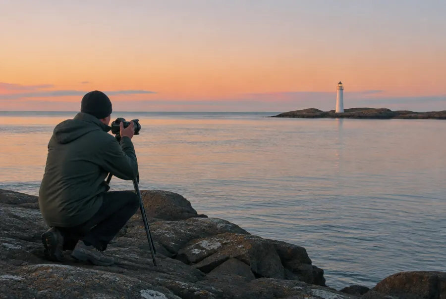
The classic move is to put the horizon on one of the horizontal lines. If you have a dramatic sky with colorful clouds, place the horizon on the lower third so the sky fills two-thirds of the frame. If the foreground is more interesting, like wildflowers, rocks or reflections in a lake, put the horizon on the upper third.
Then look for a second element to place on a vertical line or an intersection: a lone tree, a lighthouse, a mountain peak or a person on a trail. A strong landscape often uses both, a horizon on one line and a point of interest on a crossing.
Portrait photography
In portraits, the eyes are what viewers look at first. Place the subject’s eyes on or near the upper horizontal line, and if you frame the face off center, put the nearest eye on an upper intersection.
Give the subject room to look. If they face left, place them on the right third so the empty space is in front of them. This is often called lead room or look room. Framing a person so they look straight out of the edge of the photo usually feels cramped.
Street photography
Street scenes are busy, so the grid helps you decide what matters. Place a walking person on one of the vertical lines with space ahead of them in the direction they move. Use a strong line in the scene, like a curb, a shadow or the edge of a building, to anchor a third line.
A practical trick is to frame the background first, with the interesting part of the scene on a third, then wait for a person to step into that spot.
Wildlife and underwater photography
The same thinking applies to animals. Put the eye of the animal on an intersection and leave space in the direction it is looking or swimming. Underwater, a fish or a turtle placed on a third with open blue water ahead of it tells the viewer where the animal is heading. You can see how strong placement works in the 2007 winners and the 2005 winners galleries.
Rule of thirds in art and design
The rule of thirds in art goes back to landscape painting, and you still see it in paintings, film and graphic design. Cinematographers frame actors on third lines so there is room for the other person in a conversation. Web designers place key elements on third lines to guide the eye. When you study paintings in a museum or frames from a well-shot film, try spotting where the main subject sits. You will find thirds far more often than exact centers.
Related composition ideas
The rule of thirds is one tool among many. These related techniques work well with it or instead of it.
Golden ratio
The golden ratio is about 1 to 1.618. A golden ratio grid, sometimes called a phi grid, looks similar to the thirds grid, but its lines sit a little closer to the center. Some photographers also use the golden spiral, a curve that leads the eye toward one point in the frame. In practice, the thirds grid and the phi grid lead to very similar results. Use whichever one helps you see the picture.
Leading lines
Roads, rivers, fences, shorelines and rows of trees all pull the eye through a photo. Leading lines are strongest when they guide the viewer toward a subject placed on a third or on an intersection.
Negative space
Empty areas like sky, water or a plain wall give the subject room to breathe. Placing a small subject on a third with lots of empty space around it can make a simple, bold image.
Framing and balance
Natural frames like doorways, branches or arches help focus attention. When you place your subject on one third, you can balance the photo with a smaller or darker element on the opposite side.
When to break the rule of thirds
The rule of thirds is a guideline, not a law. Good photographers break it on purpose when a different composition serves the photo better. Here are common cases.
- Symmetry: reflections in still water, architecture, tunnels and bridges often look strongest when centered. If the scene is symmetrical, lean into it and center it precisely.
- Centered subjects: a face looking straight into the lens, a single flower on a clean background or a close-up of an animal’s eye can have more impact dead center. Centering creates a direct, confrontational feel.
- Patterns and textures: repeated shapes can fill the whole frame with no single subject to place.
- Minimalism: sometimes an extreme placement near the edge of the frame, far beyond a third line, gives a stronger sense of scale or isolation.
The key difference is intent. A centered subject that looks deliberate reads as a choice. A centered subject that looks accidental reads as a snapshot. Learn the rule first, then break it when you know why.
How contest judges look at composition
Composition is one of the first things a judge notices. In the EPIC judges’ guidelines, still images are scored on composition, difficulty or uniqueness, technical aspects such as lighting, exposure and focus, and overall impact.
Judges do not check whether your subject sits exactly on a grid line. They ask simpler questions: Where does my eye go first? Is there anything distracting near the edges? Does the placement support the story? Is the horizon level? A photo that follows the rule of thirds but has a bright distraction in a corner will still lose points.
Before you enter, look at each photo with the grid on and ask whether the placement feels intentional. If you want more tips on preparing an entry, read our guide on how to win a photography contest. And if you want to pair good composition with beautiful light, see our guide to golden hour photography.
Common rule of thirds mistakes
- Splitting the frame in half: a horizon through the middle often makes a landscape feel undecided. Choose sky or foreground.
- Crooked horizons: the grid lines are also great for keeping horizons level. Use them.
- No lead room: subjects looking or moving out of the frame feel cut off.
- Empty thirds with nothing to say: negative space should feel calm, not unfinished.
- Forcing the rule: if the scene is symmetrical, a thirds placement can look awkward.
Rule of thirds checklist
- Turn on the grid on your phone or camera.
- Place the main subject or the eyes on a line or an intersection.
- Put the horizon on the upper or lower third, not in the middle.
- Leave space in the direction your subject looks or moves.
- Check the edges and corners for distractions.
- Keep the horizon level using the grid lines.
- Center the subject only when symmetry or impact calls for it.
- Recheck the composition in the crop tool before you submit.